CONVERSATIONAL AI | INTERACTION DESIGN | SERVICE DESIGN
Kai is a conversational AI within the context of grief. It aims to stimulate conversations that allow individuals to vocalize, support, and reflect on their feelings of grief. Kai extends into CURAI—an assistant for counselors that transcribes sessions, keeps track of patient records, and documents their progress.
Team: Tilo Krueger, Josh LeFevre
Role: Research, Concept Development, Interaction Design, Visual Design
Tools: Cinema4D, Adobe AfterEffects, Adobe Illustrator, Sketch, Principle
Duration: 6 weeks | Carnegie Mellon University, School of Design
The challenge:
To examine the poetics of interaction in the context of AI counseling, exploring it from the perspective of both the clients and the counselors.
The use of AI continues to grow as it offers efficient solutions to problems facing people and businesses, and quick ways of accessing relevant information. However, its use is now also expanding beyond task oriented interactions into those that are imprecise, abstract and emotional.
The solution:
A service that mediates between patients and counselors and supports conversations around mental health while prioritizing human connections instead of replacing them.
Research:
We began the research process by exploring the unfamiliar realm of artificial intelligence and counseling with a focus on interviewing counselors, research papers on therapy and market study of existing AI and counseling products to determine gaps. Our exploratory questions included:
- What are hallmarks of a good patient and therapy relationship?
- What is the kind of support a client seeks during counseling?
- What are the patterns in existing tools used in the context of counseling and technology?
- What kind of information is pertinent to be reflected back to a patient when undergoing therapy?
Insights:
Synthesizing our research we were able to narrow down on four emerging gaps and leverage points that we wished to probe further, going into the process of making.
01. Lack of Access to Mental Health Treatment
How can we provide a solution for the social, financial and temporal constraints of therapy?
As we began our research a key finding that emerged was the lack of professional care received by individuals suffering from mental health issues. This was marked by (1)social stigma attached to mental health and therapy, (2)high costs of treatment and a (3)shortage of therapists to provide professional care to these individuals. In America alone almost 56% individuals suffering form mental illness did not receive treatment.
03. Grief Context:
How can AI embody care and support especially for a complex emotion of grief?
While psychological help may be required for a range of mental health problems, we chose a sharp focus in the context of grieving individuals and the baggage of processing the death of a loved one. Research suggested that while grieving individuals looked for support and comfort, they may find it hard to share these feelings with even their closest friends and family. This provided an opportunity to explore, specially in context to the role of AI as an outsider.
02. AI as an outsider
How can we leverage AI as a low threshold entry point for counseling and not a substitute?
While as a team we strongly believed that AI cannot replace human connection, it was interesting to note it’s role as an outsider, where certain individuals displayed lower levels of self-restrain and found it easier to initiate conversations and speak to an AI, in comparison to human therapists. In addition, AI provided a cost-effective and round the corner solution to some of therapy’s financial and time constraints.
04. Gaps in current offerings:
How do we bring together verbal & non-verbal interactions to represent the care of counseling?
A study of current AI therapists and voice assistants revealed some gaps in their experience and design. Most of the popular AI therapists in the market like Woebot and Replica presently build on a chat-based interface which do not fully leverage the potential of voice or visual interactions. On the other hand, voice assistants like Siri and Google Home which make use of verbal and visual interactions are defined by their strong focus on performing tasks, and their visual language limited by their functionality.
Design Principles:
Understanding our insights allowed us to lay down key design principles that guided the design of our entire experience:
Care
A comprehensive and rich interpersonal engagement, that builds on the considered care required during grief and counseling.
Simplicity
Reflect a sense of simplicity that gives space to the user to feel and speak freely and builds on the poetics of design.
Calm
Evoke a sense of calm that puts users at ease and makes them feel understood, heard and respected. A calm sensation is key for support.
Trust
Build on a considered approach that upholds trust within the users and values ethics through all its touch points.
Concept Development:
Universal metaphors for an abstract visual form
From our research, we found the visualizations of AI counselors to range on a wide spectrum of android-like robotic forms, abstract spinning dots as well as graphical renditions of human forms. As a team, we believed it was imperative to steer away from the uncanny valley of AI representations. A robotic form however would feel way alienating, specially in the context of counseling. We chose to build on an abstract visual representation that would feel approachable and relatable.
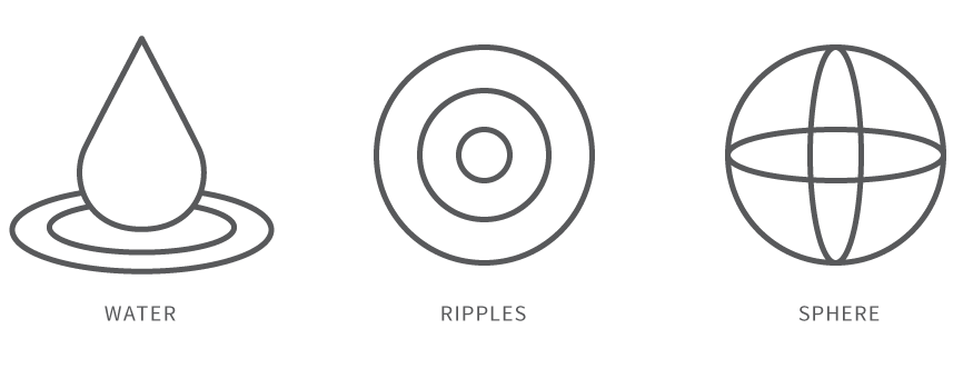
The metaphors of water and sphere provided a cross-cultural reference recognized universally as symbols of calmness and continuity. Water, understood across a range of cultures, symbolizes calmness, fluidity and clarity and the sphere acts as a symbol of continuity, healing and balance. The water and the sphere determined the visual metaphors for the form of KAI.
Colors of Calm and Care
Color theory can be subjective, hence it was important to user test our color experiments in order to inform our decisions. From our research and user testing, purple unanimously emerged as a color for care, recognized across cultures as a color for grief that worked well as the primary color for the brand. Pairing it with a warm yellow brought in a quality of calmness to the visual design, that felt well in sync with our design objectives.
A humanistic voice built for empathy:
As voice designers, working in the context of a conversational AI, the tone of voice becomes a critical touch-point. In the past few years there has been an upsurge in the technology that brings in a humanistic quality to AI voices, which we seeked to leverage. A humanistic voice rendered with comfort and care brought in a warm balance in contrast to our abstract visual form, making a holistic experience which was built to soothe and comfort.
Motions for non-verbal human interactions:
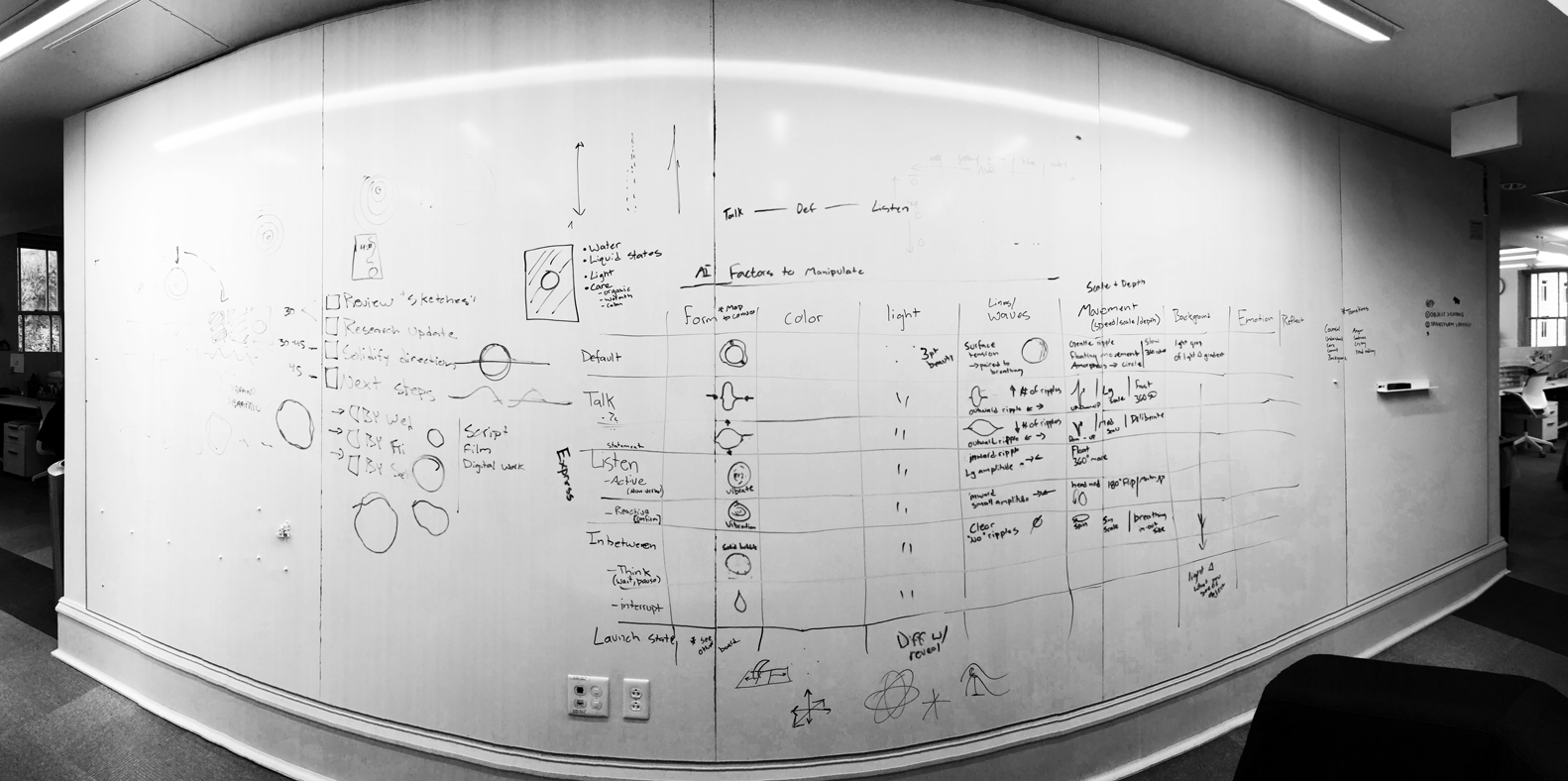
A key component of the motion design for us was to build on a vocabulary of non-verbal human interactions. This required us to push the traditional boundaries of listening and speaking states of conversational AIs to accommodate for even the pauses and prompts that are a part of our natural conversations.
1. Listening
2. Talking
3. Prompting
4. Pausing
Utilizing affordances of water as a material
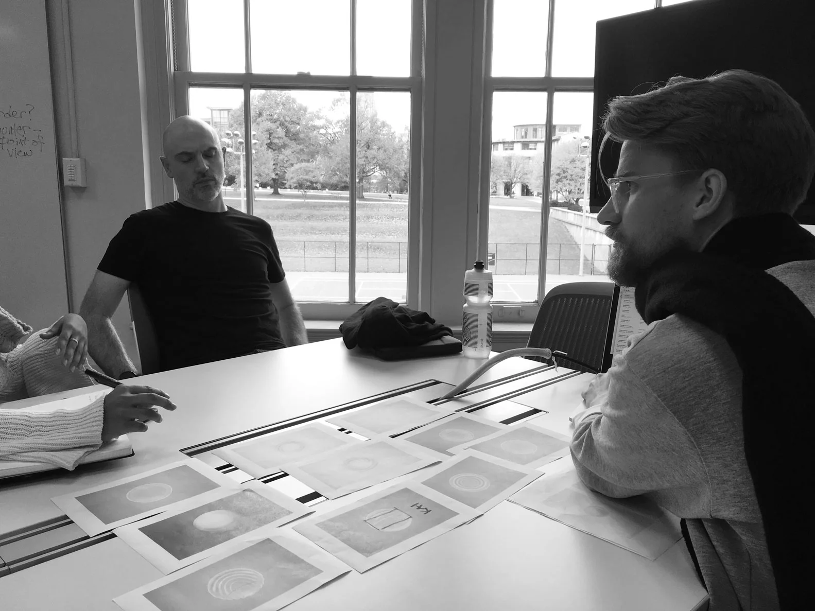
As interaction designers we studied the affordance of water as a material to experiment with variables of frequency, amplitude, motion and transparency. User testing our designs, we understood the importance of maintaining a symmetrical motion to maintain an approachable quality to the form.
Final States for Kai
The radial motion of ripples in water fit well to our approach and seamlessly blended into the the two key states of the AI — listening (ripple inwards) and speaking (ripple outwards). This formed the key guiding principle for the design of all our states.
Kai framed as a mediator was designed as a low threshold entry point for counseling rather than as a substitute to it. While Kai was designed keeping the client in mind, a holistic experience required us to design from the perspective of the counselors as well.
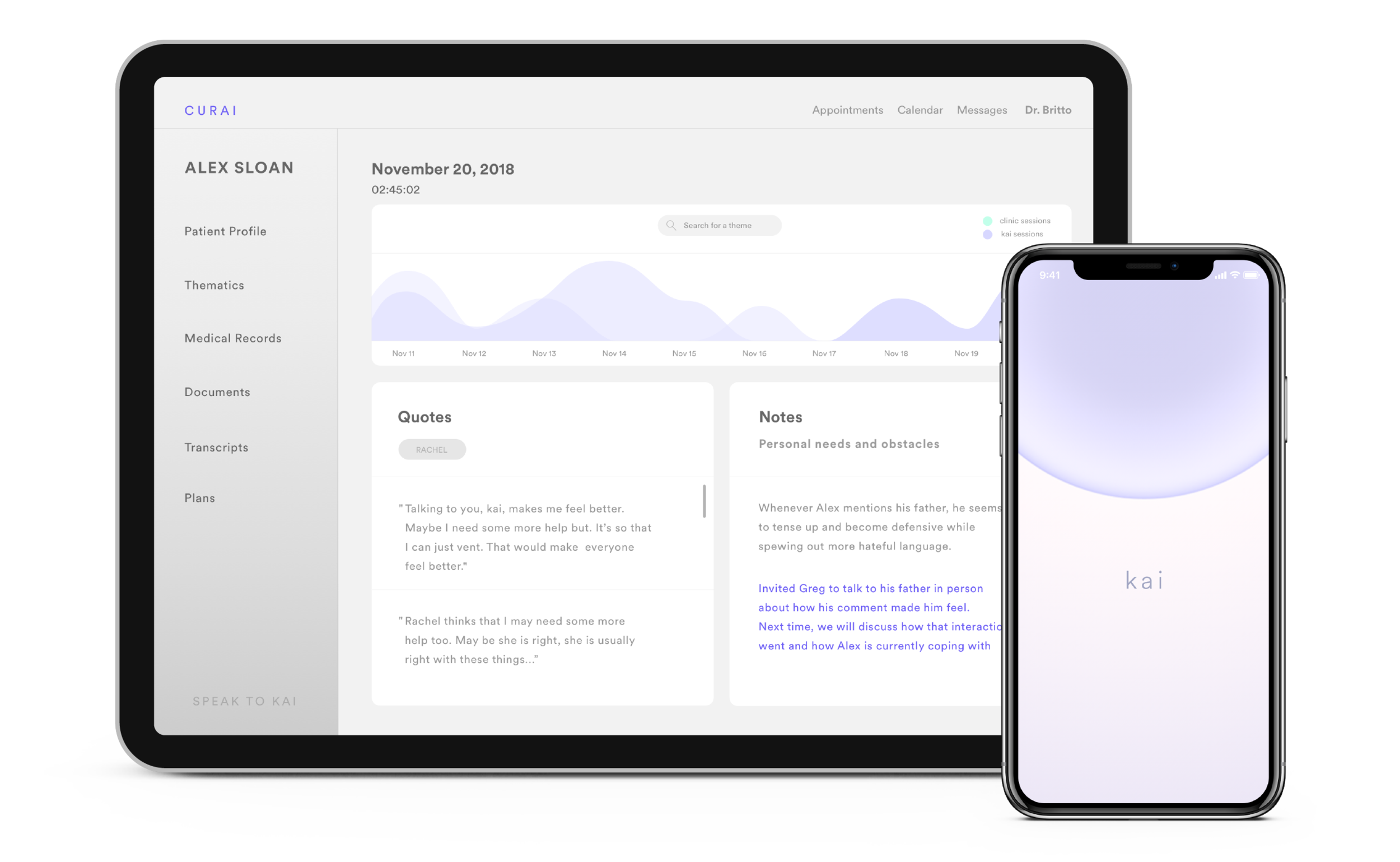
Based on our research, we developed Curai— a grief assistant, aimed to support them during therapy sessions.
Security, Transparency and Ethics
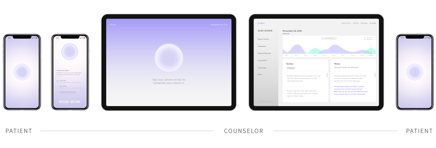
We prototyped a situation of permissions that Kai would ask the user in order to share their data with the counselor. this included permissions for the HIPPA agreement, sharing for all types of personal data, and permission to sync Kai with counselor notes, in order to maintain a ethical route at all points of the process.
Counseling Research & Insights:
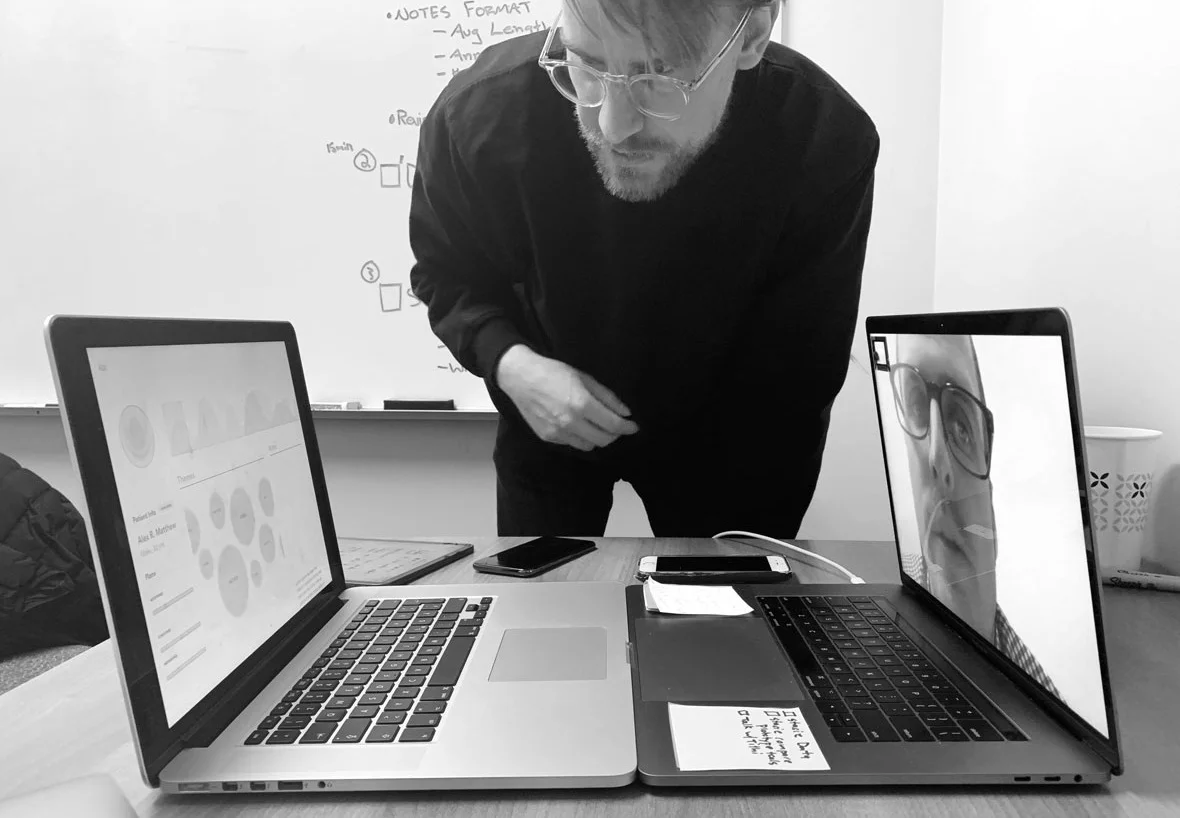
To understand the process and stages of counseling, as a team we reached out to counselors and experts on the campus as well as outside of it. Our user research and testing was critical to the insights we generated and for the foundation Curai rested on.
Data-Assessment-Plans Framework
An important learning was the DAPs framework that was followed by several therapists in the process of updating patient record from each appointment. Each session was recorded in notes that usually followed the format of Data (what was being said by the patient), Assessment ( therapist’s assessment of patient’s behavior) and Plans ( setting of long-term and short-term plans from therapy sessions). This framework formed the keystone for the wire-framing of the Counselor dashboard.
Role of Mapping Relationships
Each individual’s life is built on a myriad of relationships. These relationships sometimes are key to understanding the psychological factors behind a patient’s current state of mind. We discovered an interesting graphical representation used by therapists as a way of mapping and analyzing detailed data of an individual’s relationships in the form of genograms. The genograms became a great starting point to explore a language of data visualisation that is best understood by therapists.
Data Security
Confidentiality and trust are pillars of a client-therapist relationship. Clinics and counselors prioritize local storing of patient data with key emphasis laid on its security. It was imperative for us to uphold this value of trust through the design of the touch-points of the experience.
Transcribing Feature
When asked about how AI might help in therapy, most counselors spoke strongly in favor of the need to transcribe the conversation from sessions. We believed this could form a key feature of the dashboard to simplify the counselor’s tasks during the session, & allow them to focus on the assessment itself.
Design Objectives for Curai:
In addition to the design principles that we had laid out for the whole experience at the beginning of KAI, our research with counselors paved way to a set of critical considerations that would be a part of CURAI’s design:
Integration
How do we integrate a range of functions and records into a comprehensive yet simple whole?
Professional
How do we design a dashboard that reflects a professional and utilitarian ethos?
Data Visualisation
How do we build a distinct system of data visualisation that effectively communicates both quantitative & qualitative data from a patient’s conversation history?
Data Permissions
How might we design a system for different types of data sharing permissions given by a patient?
Trust & Security
How to establish a sense of security and trust amongst the patients?
Physical data transfer to build trust
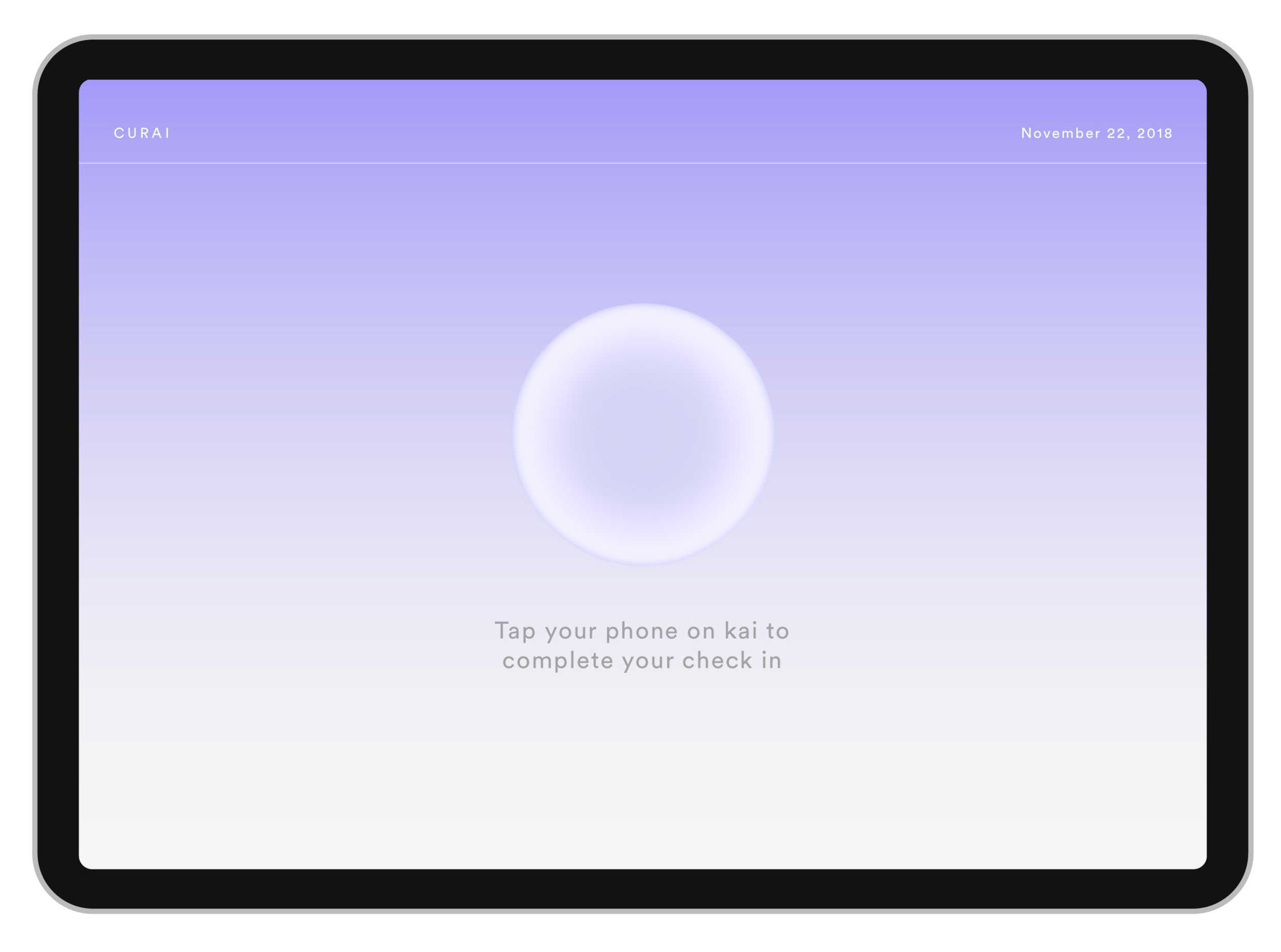
We devised a kiosk system which would be used as a point of physical transfer of data, once the patient visits the clinic, to further re-instate trust on the security of their data for the client.
Curai Design
Kai Integration
To leverage the use of Kai’s voice interface we integrated it in the Curai platform as way to summarize the Patient’s condition and as an easy point of access to data from the KAI sessions.
Dashboard Layout
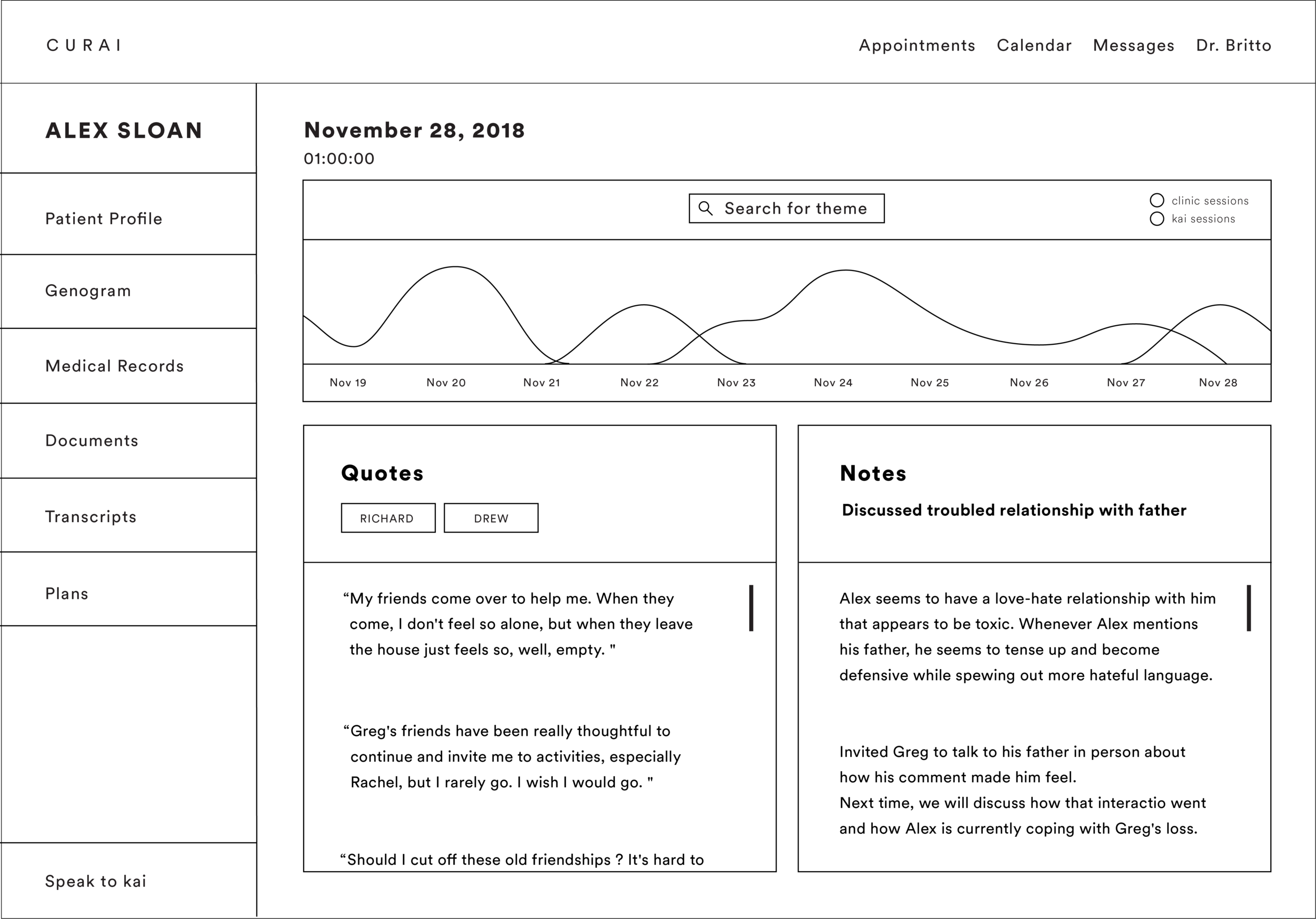
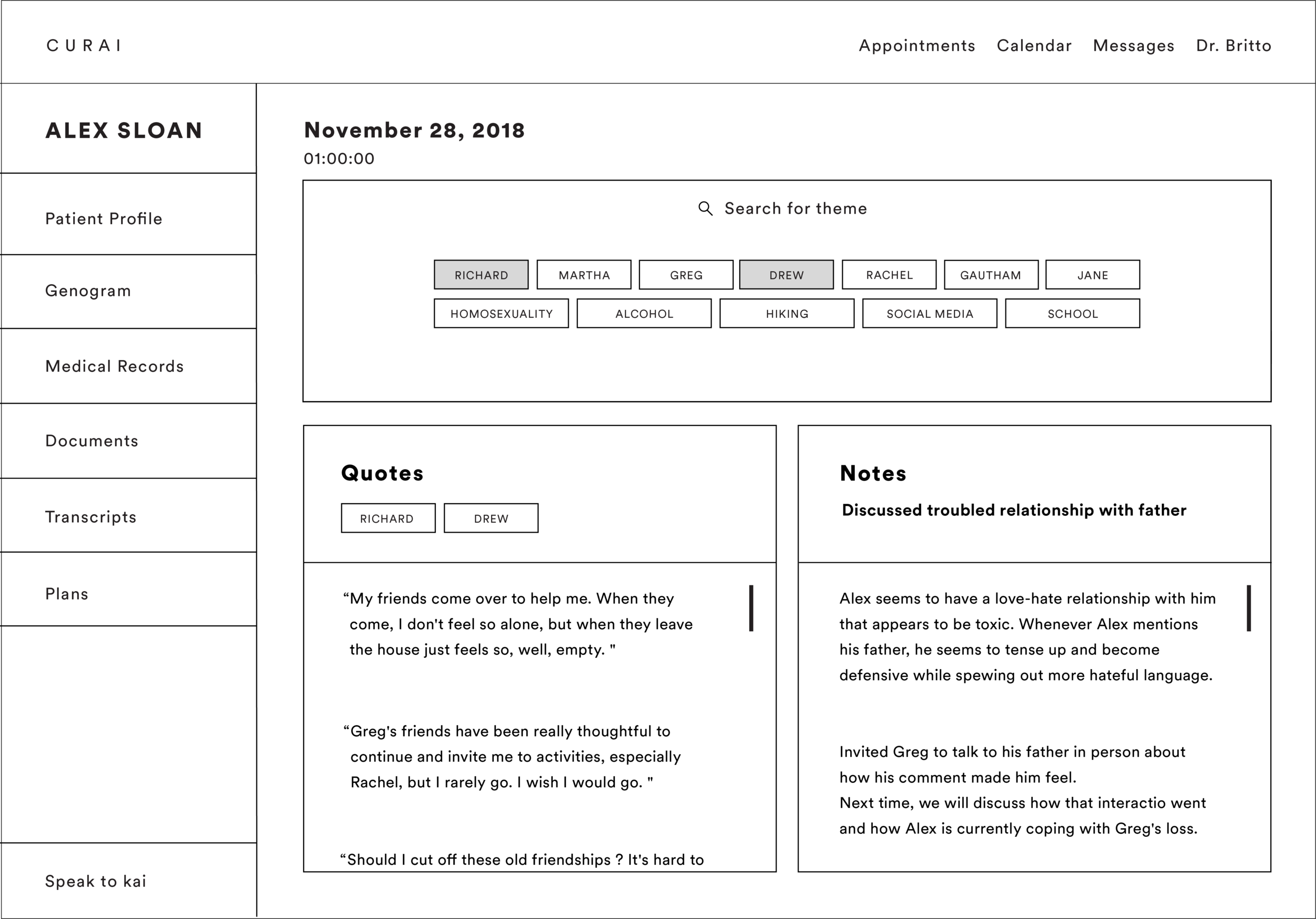
Since the landing page was a key point of interaction, we designed with a focus on components that counselors need to access right before or after a session. Building off on the DAPs model the page represented Data from the last session in the form of quotes and Assessment and Plans in the form of notes. Additional to this was a central timeline feature that used colors to distinguish between Kai(purple) and clinic sessions (mint) to allow therapists to easily scrub through any session in the past to learn more about the client.
Thematics
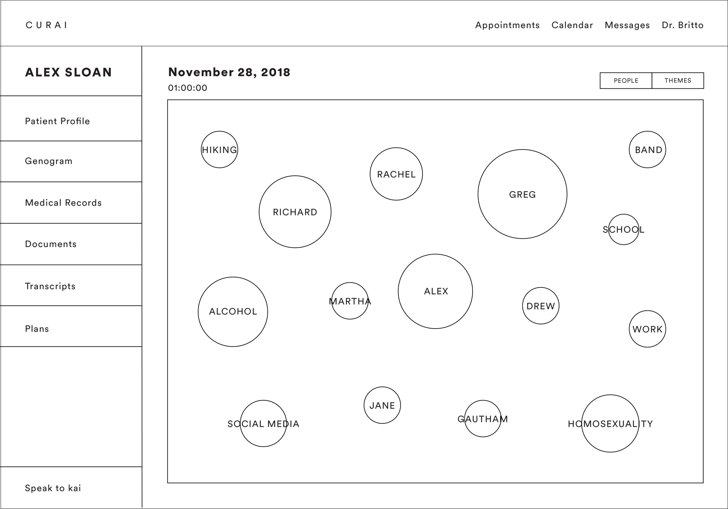
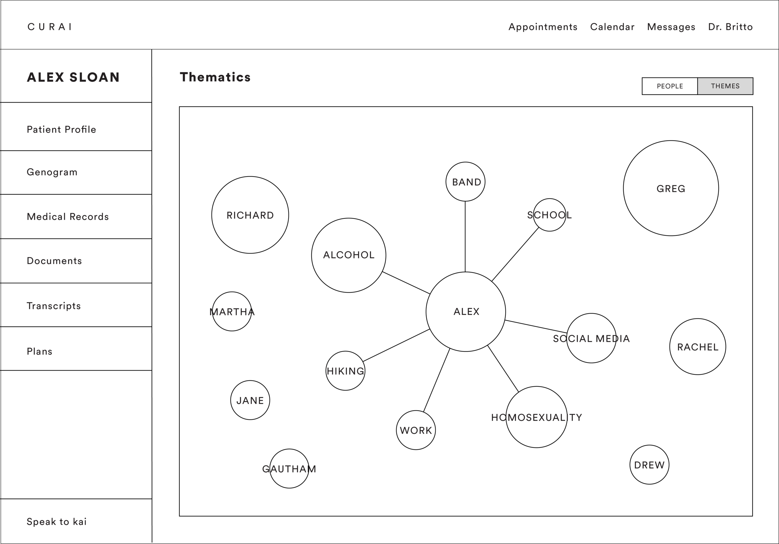
Building from the genograms, we introduced the feature of thematics as an overview into the patient’s relationships. Using lexical and concordance formats to structure this data, we envisioned this as a map of most common subjects from the history of the conversation and their co-relations, distinguished as important people and most prevalent themes in the patient’s life. This would allow therapists to view patterns in patient’s relationships and how these topics were interconnected.
The design was built on a system of interactive visualisation which depicted frequency of use through the size of the circle, positive(green) or negative(red) relationships through the use of stroke colors and its saturation to represent intensity of the relationship.
Access to transcripts
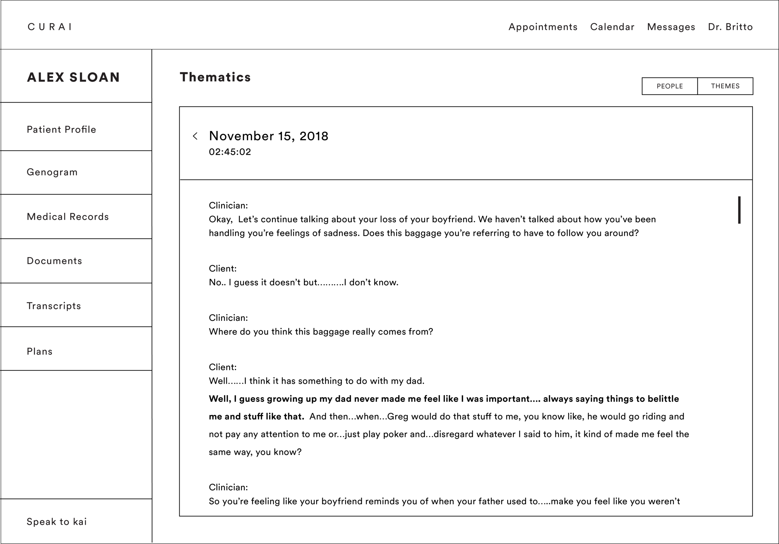
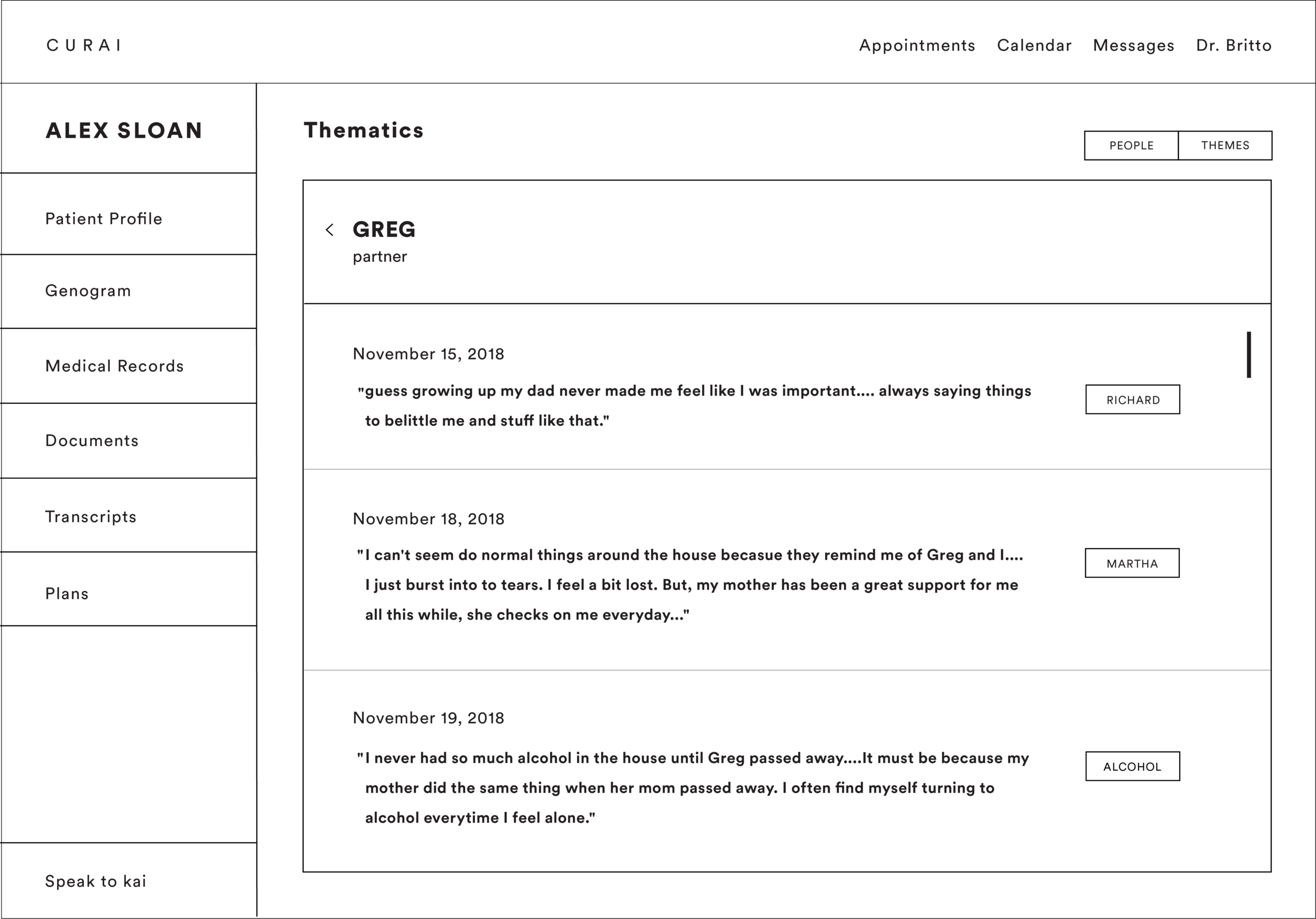
Categorized under keywords, at each point the therapist had access to the relational quotes that were said and to the full transcripts from the corresponding sessions. Accommodating for any AI-error, this gave the therapists the agency to check and interpret the conversation for themselves.
Search
Since therapists may find the need to refer back to certain pieces of information, we integrated a search feature on the dashboard which would customize all information on the page to specific keywords to allow therapists to explore a subject in greater detail.
Mid-Session Notes
Using our insight for transcribing therapy sessions, we leveraged the orientation of the iPad screen from horizontal to vertical as a way to switch into note-taking during the session itself. Accessed through a simple swipe, the note-taking section was divided into separate pages for notes and plans. The function to record specific quotes was mapped to when the therapist drew the symbol of (“) on his notes. These quotes along with other assessment notes and plans would automatically update on the dashboard at the end of the session.

